Hello Learners, article: AppBar in Flutter, Creating an AppBar in your application is a common practice. Flutter provides a built-in AppBar that we only need to customize according to our needs. So, let’s explore the AppBar in depth and cover each topic.

Introduction

Let’s understand the role of the AppBar in the context of app architecture. In terms of UX design, the AppBar plays an important role in organizing and providing navigational structure, making it a crucial element for the user experience.
The AppBar is part of the Scaffold in Flutter, which provides the basic layout of the page. The AppBar usually appears at the top of the screen and is consistent across different parts of the app.
The AppBar often carries the app’s title or logo, which contributes to the overall branding of the app. This ensures that users always know which part of the app they are in, helping create a strong sense of identity and flow through the app. For example, the title widget in the AppBar can change based on the page being displayed, making it an important component for conveying context to the user.
AppBar in Flutter
The AppBar widget is yet another convenience widget that gives you more features out of the box. AppBar is typically used in the Scaffold.appBar property, which fixes it to the top of the screen with a certain height.
The most notable feature of AppBar is that it provides navigation features for free. It automatically inserts a menu button if the app bar’s parent is a scaffold and the drawer argument isn’t null. And if the Navigator of your app detects that you’re on a page that can navigate “back” (like a browser’s back button), it automatically inserts a back button.

In the AppBar widget there are multiple parameters that expect widgets as arguments. These arguments correspond to specific positions within the app bar.
The property that handles these menu buttons and back buttons is called the leading action, and it can be configured with the AppBar.leading and AppBar.automaticallyImplyLeading properties. For example, maybe you don’t want a menu button to appear. You can set AppBar.automaticallyImplyLeading to false and then pass the leading argument to whatever widget you wish. This will attempt to place that widget
on the app bar’s far-left side.
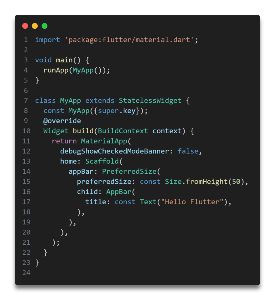
PreferredSize Widget
In Flutter, widget sizes are generally constrained by the parent. Once a widget knows its constraints, it chooses its own final size. The constraints passed to a widget by its parent tell the widget how big it can be, but they aren’t concerned with its final size.
The advantage of this system (as opposed to HTML, for
example, where elements control their own constraints) is flexibility. It allows Flutter to make intelligent decisions about what your widgets should look like and removes some of that burden from the developer.
In some cases, flexibility isn’t desirable, though. You may want to set explicit sizes for widgets. A good example is AppBar.
The AppBar class extends a widget called PreferredSize, which allows you to define an explicit height and width. Flutter will do its best to make sure the app bar is that size when the screen renders. This widget isn’t commonly used in my experience, but it serves as an example for a valuable lesson.
The Scaffold.appBar property expects a widget that’s specifically of the PreferredSize class, because it wants to know the size of the app bar before it sets constraints. In this app, I use a PreferredSize directly, rather than using an app bar in the Scaffold.appBar argument. The practical application is that you can wrap any widget in a PreferredSize and use it in place of the Material-specific AppBar widget.
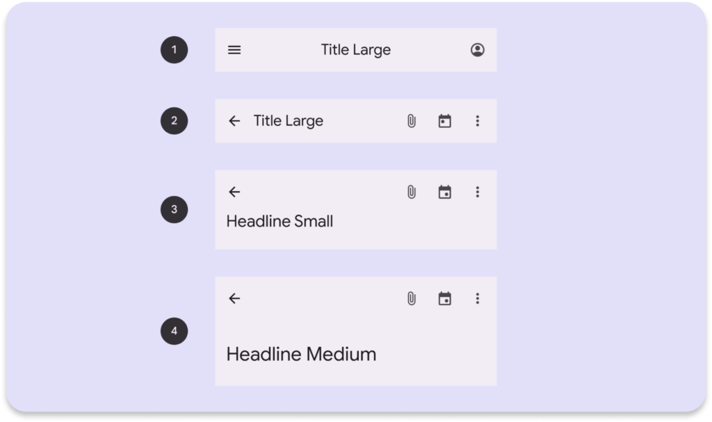
Top app bars
After reading all these coding things if you still don’t understand how to design app bar that suits on your project so let me tell you something here is the basic professional AppBar design pattern so you can try to use it.

- Contains a title and actions related to the current screen.
- For types: center-aligned, small, medium, and large.
- On scroll, apply a container fill color to separate ap bar from body content.
- Top app bars have the same width as the device window.
Center-aligned AppBar
import 'package:flutter/material.dart';
import 'package:google_fonts/google_fonts.dart';
import 'package:grokking_flutter/Temp/Profile.dart';

class AppBarWidget extends StatelessWidget {
  const AppBarWidget({super.key});

  @override
  Widget build(BuildContext context) {
    return Scaffold(
      appBar: AppBar(
        leading: Builder(
          builder: (BuildContext context) {
            return IconButton(
              onPressed: () {
                Scaffold.of(context).openDrawer();
              },
              icon: const Icon(Icons.menu),
            );
          },
        ),
        title: Center(
          child: Text(
            "Shivam",
            style: GoogleFonts.exo2(
              fontSize: 22,
            ),
          ),
        ),
        actions: [
          IconButton(
            onPressed: () {
              Navigator.push(
                context,
                MaterialPageRoute(
                  builder: (context) => const ProfileOpen(),
                ),
              );
            },
            icon: const Padding(
              padding: EdgeInsets.all(8.0),
              child: Icon(Icons.person_2_rounded),
            ),
          )
        ],
      ),
      drawer: Drawer(
        child: ListView(
          padding: EdgeInsets.zero,
          children: [
            Container(
              height: 100,
              color: Colors.indigoAccent,
            ),
            MaterialButton(
              onPressed: () {
                Navigator.pop(context);
              },
              child: const Text("Close"),
            )
            // Add more items here as needed
          ],
        ),
      ),
    );
  }
}
Small AppBar
import 'package:flutter/material.dart';
import 'package:google_fonts/google_fonts.dart';
import 'package:grokking_flutter/Temp/Profile.dart';

class small extends StatelessWidget {
  const small({Key? key}) : super(key: key);

  @override
  Widget build(BuildContext context) {
    return Scaffold(
      appBar: AppBar(
        leading: Builder(
          builder: (BuildContext context) {
            return IconButton(
              onPressed: () {
                Scaffold.of(context).openDrawer();
              },
              icon: const Icon(Icons.menu),
            );
          },
        ),
        title: Text(
          "Shivam",
          style: GoogleFonts.exo2(
            fontSize: 22,
          ),
        ),
        actions: [
          const Padding(
            padding: EdgeInsets.all(8.0),
            child: Icon(
              Icons.attachment_rounded,
            ),
          ),
          const Padding(
            padding: EdgeInsets.all(8.0),
            child: Icon(Icons.calendar_month_rounded),
          ),
          IconButton(
            onPressed: () {
              Navigator.push(
                context,
                MaterialPageRoute(
                  builder: (context) => const ProfileOpen(),
                ),
              );
            },
            icon: const Icon(Icons.more_vert),
          ),
        ],
      ),
      drawer: Drawer(
        child: ListView(
          padding: EdgeInsets.zero,
          children: [
            Container(
              height: 200,
              color: Colors.redAccent,
            ),
            MaterialButton(
              onPressed: () {
                Navigator.pop(context);
              },
              child: const Text("Close"),
            ),
          ],
        ),
      ),
    );
  }
}
Medium AppBar
import 'package:flutter/material.dart';
import 'package:google_fonts/google_fonts.dart';
import 'package:grokking_flutter/Temp/Profile.dart';

class Medium extends StatelessWidget {
  const Medium({Key? key}) : super(key: key);

  @override
  Widget build(BuildContext context) {
    return Scaffold(
      appBar: PreferredSize(
        preferredSize: const Size.fromHeight(100),
        child: AppBar(
          leading: Builder(
            builder: (BuildContext context) {
              return IconButton(
                onPressed: () {},
                icon: const Icon(Icons.menu),
              );
            },
          ),
          actions: [
            const Padding(
              padding: EdgeInsets.all(12),
              child: Icon(Icons.attachment_sharp),
            ),
            const Padding(
              padding: EdgeInsets.all(8.0),
              child: Icon(Icons.calendar_month),
            ),
            IconButton(
              onPressed: () {
                Navigator.push(
                  context,
                  MaterialPageRoute(
                    builder: (context) => const ProfileOpen(),
                  ),
                );
              },
              icon: const Icon(Icons.more_vert),
            ),
          ],
          bottom: PreferredSize(
            preferredSize: const Size.fromHeight(30),
            child: Row(
              children: [
                Padding(
                  padding: const EdgeInsets.only(left: 20),
                  child: Text(
                    "Shivam",
                    style: GoogleFonts.exo2(fontSize: 30),
                  ),
                ),
              ],
            ),
          ),
        ),
      ),
    );
  }
}
Large AppBar
import 'package:flutter/material.dart';
import 'package:google_fonts/google_fonts.dart';
import 'package:grokking_flutter/Temp/Profile.dart';

class Large extends StatelessWidget {
  const Large({Key? key}) : super(key: key);

  @override
  Widget build(BuildContext context) {
    return Scaffold(
      appBar: PreferredSize(
        preferredSize: const Size.fromHeight(120),
        child: AppBar(
          leading: Builder(
            builder: (BuildContext context) {
              return IconButton(
                onPressed: () {
                  Scaffold.of(context).openDrawer();
                },
                icon: const Icon(Icons.menu),
              );
            },
          ),
          actions: [
            const Padding(
              padding: EdgeInsets.all(12),
              child: Icon(Icons.attachment_sharp),
            ),
            const Padding(
              padding: EdgeInsets.all(8.0),
              child: Icon(Icons.calendar_month),
            ),
            IconButton(
              onPressed: () {
                Navigator.push(
                  context,
                  MaterialPageRoute(
                    builder: (context) => const ProfileOpen(),
                  ),
                );
              },
              icon: const Icon(Icons.more_vert),
            ),
          ],
          flexibleSpace: FlexibleSpaceBar(
            titlePadding: const EdgeInsets.only(left: 20, bottom: 5),
            title: Text(
              "Shivam",
              style: GoogleFonts.exo2(fontSize: 30),
            ),
          ),
        ),
      ),
      drawer: Drawer(
        child: ListView(
          padding: EdgeInsets.zero,
          children: [
            Container(
              height: 200,
              color: Colors.lightGreen,
            )
          ],
        ),
      ),
    );
  }
}
Constructor in AppBar

In Flutter every thing is a widget and widget is nothing its just a Class by using Dart Programming language.
super.key
In Flutter, when you create a UI using widgets, a tree structure is formed in the backend, which grows increasingly complex and large as the UI becomes more intricate. This is how Flutter renders the UI. In this tree structure, every time you use StatelessWidget or StatefulWidget, maintaining the uniqueness of each widget is crucial. This is where super.key plays an important role. It ensures that Flutter can differentiate between widgets, even if they appear similar, by providing a unique identifier for each one.
A Key is a special identifier in Flutter that helps manage the widget tree. When a widget is rebuilt (due to changes in the state), Flutter uses the Key to match old widgets with new ones, ensuring that specific parts of the widget tree retain their identity. This is especially important when dealing with dynamic lists, animations, and state management.
leading in AppBar
The widget displayed before the title, typically a back button or a hamburger menu for navigation that’s it.

automaticallyImplyLeading in AppBar
If true, Flutter automatically shows a back button when the app navigates to a new screen. Example: automaticallyImplyLeading: false would hide the back button on navigation.
title in AppBar
The main title text in the middle of the AppBar. Example:
title: Text('My App')displays “My App” as the title.
actions in AppBar
Widgets to display on the right side of the AppBar, usually for actions like settings or search buttons. The actions property accepts a list of widgets, allowing you to add multiple widgets as needed.

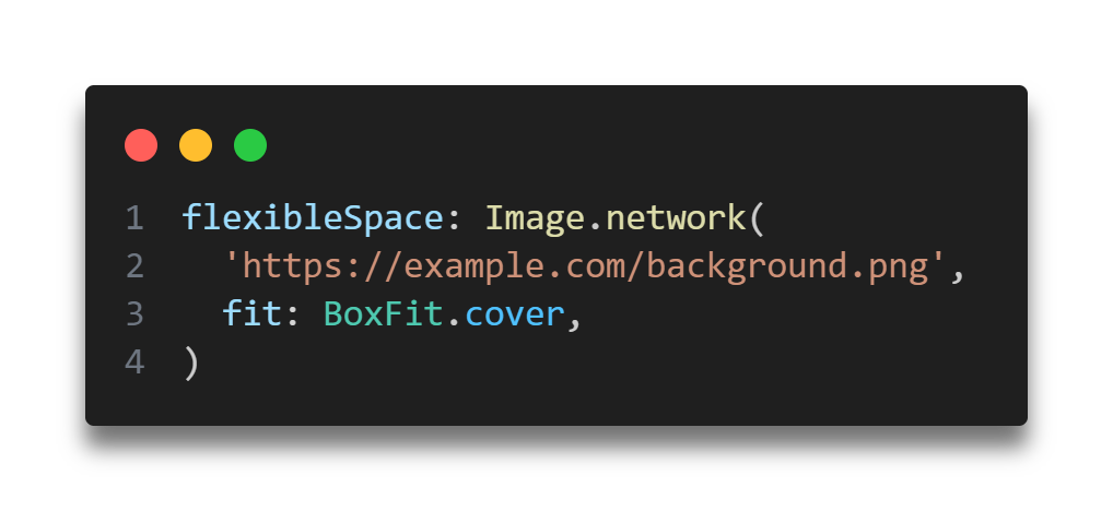
flexibleSpace in AppBar
see this image again:

This image shows the analogy of the AppBar in Flutter. The area of flexibleSpace is a widget that can fill all the space behind the AppBar. It is useful for backgrounds or adding complex designs.
bottom in AppBar
In bottom you can add another widget like a Tab bar or any creative idea if you have. Example: You might use this with a TabBar to create navigation tabs.
elevation in AppBar
This adds a shadow effect below the AppBar, giving it a raised appearance. Example: elevation: 4.0 gives the AppBar a slight shadow.
scrolledUnderElevation in AppBar
This adds a specific shadow effect the app is scrolled. Example: scrolledUnderElevation: 6.0 would change the shadow when scrolling happens under the AppBar.
notificationPredicate in AppBar
Controls when notifications are sent during scrolling events. It’s a more advanced property used in specific cases. In simpler terms, it lets you decide when the AppBar should expand, collapse, or react based on user scrolling.
How Does It Work?
- The
notificationPredicateis a function that takes aScrollNotificationand returns a boolean (bool). - Return
true: TheSliverAppBarresponds to that scroll notification. - Return
false: TheSliverAppBarignores that scroll notification.
shadowColor in AppBar
Sets the color of the shadow when the elevation is applied. Example: shadowColor: Colors.blue would give the AppBar’s shadow a blue tint.
surfaceTintColor in AppBar
This is used in Material 3 for adjusting the color appearance of the AppBar’s surface.
shape in AppBar
Defines the shape of the AppBar, allowing customization like rounded corners or edges. xample: You can use RoundedRectangleBorder to create a custom shape.
backgroundColor
Changes the background color of the AppBar. Example: backgroundColor: Colors.green makes the AppBar green.
foregroundColor in AppBar
Controls the color of the text and icons on the AppBar. Example: foregroundColor: Colors.white makes the text and icons white.
iconTheme in AppBar
Customizes the color, size, and style of icons in the AppBar. Example:

actionsIconTheme in AppBar
Similar to iconTheme but specifically for the icons in the actions section (right side). Example: Same usage as iconTheme.
primary in AppBar
Determines whether this AppBar is a primary AppBar for the screen. It’s mostly used when dealing with multiple toolbars. Example: Set to false if this AppBar isn’t the primary toolbar.
centerTitle in AppBar
Aligns the title to the center of the AppBar. Example: centerTitle: true centers the title.
excludeHeaderSemantics in AppBar
If set to true, the title won’t be announced by accessibility services, which is useful for custom header elements.
- Accessibility services (like screen readers) are used by people who can’t see the screen clearly or at all. These services “read out” or describe what’s on the screen, like the title of an app.
- The
titleof anAppBaris usually the text that describes the current page (e.g., “Home,” “Settings”).
If you set excludeHeaderSemantics to true: The title of the AppBar will not be announced by the screen reader.
titleSpacing in AppBar
Controls the spacing around the title widget. Example: titleSpacing: 10.0 adds 10 pixels of space around the title.
toolbarOpacity in AppBar
Controls the transparency of the toolbar part of the AppBar. Example: toolbarOpacity: 0.8 makes the AppBar 80% opaque.
bottomOpacity in AppBar
Adjusts the opacity of the bottom widget (such as a TabBar). Example: Similar to toolbarOpacity, but it affects the bottom area.
toolbarHeight in AppBar
Sets the height of the AppBar. Example: toolbarHeight: 100.0 would make the AppBar taller.
leadingWidth in AppBar
Sets the width of the leading widget (the widget at the start of the AppBar). Example: leadingWidth: 60.0 makes the leading icon area wider.
toolbarTextStyle in AppBar
Specifies the text style for any text displayed inside the AppBar.
titleTextStyle in AppBar
Sets a custom style for the title text. Example: titleTextStyle: TextStyle(color: Colors.yellow, fontSize: 24).
systemOverlayStyle in AppBar
Controls the status bar’s appearance when the AppBar is displayed, such as the color of the icons and text.
forceMaterialTransparency in AppBar
If true, the AppBar will use transparency without background.
clipBehavior
Controls how the content of the AppBar will be clipped (cut off) if it overflows the bounds of the AppBar.
These properties allow you to customize the look and behavior of the AppBar to fit your app’s design. Thank you for taking the time to read! Feel free to explore more of our content or leave a comment below.
Read More article related Flutter.
[…] Flutter 102: Exploring AppBar in Flutter – Tips and Tricks Flutter 101: Essential Layout Techniques for Designing UIs in Flutter […]
[…] you can use an AppBar. If you’re unsure how to implement an AppBar, check out this article: Exploring AppBar in Flutter – Tips and Tricks. You typically place the TabBar inside the bottom property of an […]