Hello Learners! In this article we understand step by step how to create a Bottom Navigation Bar in Flutter

Introduction
Bottom Bar Navigation in Flutter is an important feature that helps users navigate between different screens or sections of an app, usually placed at the bottom. It’s commonly used in mobile apps to allow users to switch between different views with ease. In simple terms, it is a UI element that helps users navigate between different views or pages in an app, typically placed at the bottom of the screen.
What is the Bottom Navigation Bar?
The BottomNavigationBar is a widget that appears at the bottom of the app screen. It allows users to switch between different sections (views) of the app, such as “Home”, “Profile”, and “Settings.” It usually contains 2 to 5 items, each representing a different page in the app. Each item can have an icon, a label, or both. You usually use the BottomNavigationBar inside a Scaffold widget (the basic structure of a Flutter page), where it is set as the bottomNavigationBar property.
How is the Bottom Navigation Bar used in Flutter?
Think of it like the navigation bar in apps like Instagram or YouTube, where you have icons at the bottom for Home, Search, Notifications, etc. When you click on one of them, it takes you to that section without opening a new screen or losing your previous place in the app.
- Icons or Tabs: You can add several items (like icons or text) that represent different pages in your app.
- Switching Pages: When a user taps on one of the items, you can use logic to switch the displayed page.
- Highlighted Tab: The tab that’s currently active is highlighted to let the user know where they are.
Bottom Navigation Bar in Flutter
As you know that you can use the Bottom Navigation Bar inside a Scaffold widget.
Step 1:
Create a void main function, as that is where the app starts building.

Step 2:
As you can see, the runApp function takes a parameter of MyApp, which extends either a StatelessWidget or a StatefulWidget. Inside MyApp, it returns a MaterialApp widget, which serves as the root of your app

Now you can clearly see that MyApp is a class that extends the StatelessWidget class, which means that this widget does not have any mutable state. The appearance of the widget is fixed and doesn’t change over time.
And the build method is overriding a method from the superclass (StatelessWidget). In this case, it’s required because all widgets that extend StatelessWidget must implement a build method. The build method is responsible for describing how the widget should look in terms of other widgets. It takes a BuildContext parameter, which provides information about the location of this widget in the widget tree and access to theme data, among other things.
Inside the build method, it returns a MaterialApp widget. MaterialApp is a predefined widget that sets up the basic structure of a Flutter app following Material Design guidelines.
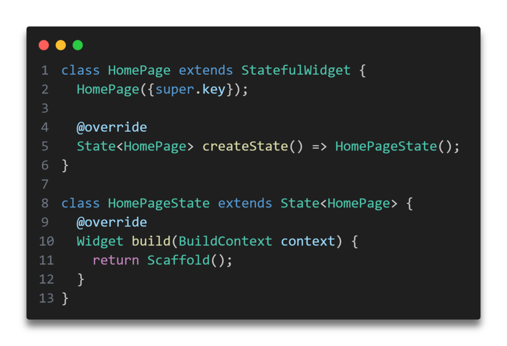
The home property of MaterialApp specifies the main or initial widget of the app, which in this case is HomePage(). The HomePage widget would be another class you define, usually representing the main screen of the app.
Step 3:
Now, it’s time to create the HomePage() class, which extends StatefulWidget. Let me explain why: when you implement a bottom navigation bar in the home page, every time the user presses a bottom navigation icon, the home page needs to update the currentIndex. This index tracks which icon or tab the user has pressed. Based on the user’s behavior, you can navigate them to the corresponding screen.
Follow all step

or you can try this too.
import 'package:flutter/material.dart';

void main() => runApp(MyApp());

class MyApp extends StatefulWidget {
  @override
  _MyAppState createState() => _MyAppState();
}

class _MyAppState extends State<MyApp> {
  int _selectedIndex = 0; // Keeps track of the selected item

  // A method to update the selected index when an item is tapped
  void _onItemTapped(int index) {
    setState(() {
      _selectedIndex = index;
    });
  }

  @override
  Widget build(BuildContext context) {
    return MaterialApp(
      home: Scaffold(
        appBar: AppBar(title: Text('BottomNavigationBar Example')),
        body: Center(
          child: Text('Selected Page: $_selectedIndex'),
        ),
        bottomNavigationBar: BottomNavigationBar(
          items: const <BottomNavigationBarItem>[
            BottomNavigationBarItem(
              icon: Icon(Icons.home),
              label: 'Home',
            ),
            BottomNavigationBarItem(
              icon: Icon(Icons.business),
              label: 'Business',
            ),
            BottomNavigationBarItem(
              icon: Icon(Icons.school),
              label: 'School',
            ),
          ],
          currentIndex: _selectedIndex, // The currently selected item
          selectedItemColor: Colors.amber[800], // Color of the selected item
          onTap:
              _onItemTapped, // Updates the selected index when an item is
                             //tapped
        ),
      ),
    );
  }
}
Types of Navigation Bar
The navigation bar has two types that decide how the items behave:
- fixed:
- This type is used when there are less than 4 items.
- All items have the same style.
- The selected item has a distinct color.
- shifting:
- This is used when there are 4 or more items.
- When an item is selected, it shifts in style, and each item has a different background color.
By default, fixed is used if there are fewer than 4 items, and shifting is used when there are 4 or more items.
Updated NavigationBar (Material 3)
Flutter also offers a newer NavigationBar widget that is part of Material 3. This widget looks slightly different and has a few changes in the API.
Key Differences in NavigationBar
- Items are now NavigationDestination:
- Instead of BottomNavigationBarItem, the newer NavigationBar uses NavigationDestination.
- Callback Change:
- In BottomNavigationBar, you use onTap to detect when a user taps an item. In NavigationBar, you use onDestinationSelected for the same purpose.
- Indexing:
- In BottomNavigationBar, you use currentIndex to track the selected item. In NavigationBar, you use selectedIndex.

Deep Dive into Bottom Navigation Bar in Flutter
Let’s break down each parameter step-by-step to understand its role in customizing the navigation bar:

This constructor is like setting up a bar with several buttons (items) at the bottom of your app’s screen. Each button can show different icons and labels, and you can customize how they look when they are selected or not. You also control what happens when a button is pressed (like switching to a different page or performing an action). The asserts in the last ensure that everything you set up makes sense and won’t cause problems when the app runs.
- super.key
- This allows you to use a key that identifies the widget in the widget tree, which can help in debugging or when the widget needs to be replaced.
- required this.items
- This parameter is essential and must be provided when creating the navigation bar.
itemsis a list ofBottomNavigationBarItemobjects, each representing a single item in the navigation bar.
- This parameter is essential and must be provided when creating the navigation bar.
- this.onTap
- This is a callback function that is called when an item is tapped. It passes the index of the tapped item, allowing you to handle user interaction.
- this.currentIndex = 0
- Specifies which item in the navigation bar is currently active or selected. By default, it is set to 0, meaning the first item is selected initially.
- this.elevation
- This determines the size of the shadow below the navigation bar. A higher value means a more prominent shadow.
- this.type
- This can change the layout of the items in the navigation bar, for example, shifting their positions or how they are displayed.
- this.backgroundColor
- Sets the background color of the navigation bar.
- this.fixedColor
- Specifies the color to use when a navigation bar item is selected. It’s used when the navigation bar type is fixed.
- this.iconSize = 24.0
- Sets the size of the icons in the navigation bar. The default size is 24.0 pixels.
- this.selectedItemColor
- This sets the color of the item icon and text when it is selected.
- this.unselectedItemColor
- Sets the color of the item icon and text when it is not selected.
- this.selectedIconTheme
- Provides styling for the selected item icons, overriding the default icon theme.
- this.unselectedIconTheme
- Provides styling for the unselected item icons.
- this.selectedFontSize = 14.0
- The font size of the text of the selected item.
- this.unselectedFontSize = 12.0
- The font size of the text of the unselected items.
- this.selectedLabelStyle
- Provides styling for the text labels of selected items.
- this.unselectedLabelStyle
- Provides styling for the text labels of unselected items.
- this.showSelectedLabels
- Determines whether labels of the selected items should be displayed.
- this.showUnselectedLabels
- Determines whether labels of the unselected items should be displayed.
- this.mouseCursor
- Defines the type of mouse cursor to display when hovering over the items, applicable for web and desktop platforms.
- this.enableFeedback
- Whether to play a sound on item selection.
- this.landscapeLayout
- Determines the layout behavior when the device is in landscape mode.
- this.useLegacyColorScheme = true
- Decides whether to use older or newer color styles for themes.
- asserts:
- These are checks that ensure the parameters provided are valid. For example, it checks that there are at least two items, the
currentIndexis valid, etc. These are used for debugging and to prevent errors during development.
- These are checks that ensure the parameters provided are valid. For example, it checks that there are at least two items, the
That’s how you can create your bottom navigation bar. If my guidance helped you, feel free to share your bottom navigation bar in the comment section — I’d love to see it! Don’t forget to share.
Thank you for taking the time to read! Feel free to explore more of our content or leave a comment below.
[…] Flutter 103: Exploring Bottom Navigation Bar in Flutter Flutter 102: Exploring AppBar in Flutter – Tips and Tricks Flutter 101: Essential Layout Techniques for Designing UIs in Flutter […]
[…] what the Bottom Navigation Bar is and how to create it? If not, first read this article about the Bottom Navigation Bar. If yes, you’ll be surprised to learn that the Navigation Rail widget is quite similar to the […]