Hello Learners, in this article, we will learn about what a Sliver App Bar is and how to create a Sliver App Bar with perfect scroll effects.
A SliverAppBar in Flutter is a specialized version of the standard AppBar that seamlessly integrates with a CustomScrollView. This widget is particularly useful when you want to create scrollable layouts that have dynamic app bars that expand and collapse as the user scrolls. For example, consider how apps like Instagram adjust the size of the app bar as you scroll through content, providing a more immersive and interactive user experience.
Introduction

In Flutter, a SliverAppBar is a type of AppBar that integrates with CustomScrollView. This means that when you want to feature something like an Instagram feed, the SliverAppBar automatically changes its size (expands/collapses) based on how the user scrolls through the content.
The SliverAppBar contains common elements such as a toolbar, TabBar, and FlexibleSpaceBar, and typically includes buttons like IconButtons for common actions. It can also include a PopupMenuButton for additional options.
How does it work?
- A SliverAppBar is often the first widget inside a CustomScrollView, allowing it to scroll along with the rest of the content.
- It adjusts its height as you scroll, either expanding (getting larger) or collapsing (getting smaller), based on how much the user scrolls.
- If you need a non-scrollable AppBar, you’d use a regular AppBar instead.
- The AppBar can contain various elements like leading (icon), title, actions (buttons), and a FlexibleSpace widget that adjusts based on the scroll.
Create Sliver App Bar in Flutter
A Home Page extends StatelessWidget that represents the main screen of your app. It builds the UI of the page using the build method and Scaffold provides the basic structure for the UI, like an empty page, and allows adding app bars, floating action buttons, and other UI elements.
In this case, the main part of the body is a CustomScrollView.

CustomScrollView
This widget allows creating scrollable areas that combine slivers, which are parts of the scrollable content that can change their size (e.g., a list of items, a collapsible app bar).The CustomScrollView here contains a SliverAppBar and a SliverList.
Sliver AppBar
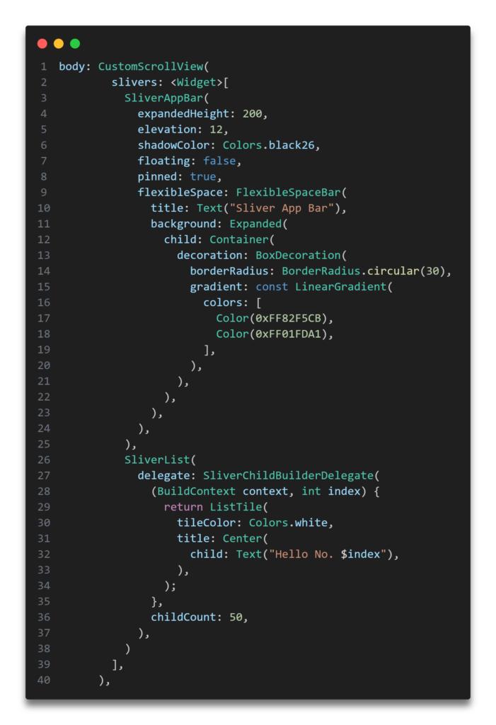
This is a special type of app bar that can scroll, expand, and collapse. To set the maximum height the app bar can expand to (200 pixels here), use the expandedHeight parameter. If the floating parameter is set to true, the app bar will float over the content (in this case, it’s false, so it stays attached).
To keep the app bar visible at the top when collapsed, always set the pinned parameter to true. The area inside the app bar that can expand or collapse is controlled by the flexibleSpace parameter, as shown in the code example.
- title: The title of the app bar, “Sliver App Bar”.
- background: A background image that fits inside the app bar, loaded from a URL.
SliverList
This is the scrollable list of items that follows the SliverAppBar.
- SliverChildBuilderDelegate: This is a delegate that dynamically builds the items in the list. If you’re unsure about what “delegate” means in Flutter, it refers to an object that provides data or creates widgets when requested, often dynamically, as part of a larger structure like a list or grid. Delegates are particularly useful when working with collections of items or content that need to be generated based on conditions such as scroll position or index.
The SliverChildBuilderDelegate is specifically used in SliverList or SliverGrid to efficiently create child widgets on demand. It’s commonly used when displaying a large list or grid of items, where building all items at once would be unnecessary or inefficient, as only a few items are visible on the screen at any given time.
In this case, the builder function creates a ListTile widget for each list item, displaying a centered text saying, “Hello No. $index”, where $index represents the item number.
- childCount: Specifies the total number of items in the list (50 items here).
That’s how you can create your Sliver Appbar. If my guidance helped you, feel free to share Sliver Appbar screenshot in the comment section — I’d love to see it! Don’t forget to share.
Thank you for taking the time to read! Feel free to explore more of our content or leave a comment below.